What typeface should you choose for your communications?
Typography is a key element of a graphic identity, helping to give a brand or company a coherent, recognizable visual identity. What typeface should you choose for your visual identity?
How important is typography in a visual identity?
Typography is a means of visual communication. It can be used to convey important information such as a brand's name, values, slogan and so on. Typography can help give the desired impression (professional, modern, creative, etc.) by using a suitable font. A graphic charter is intended to maintain visual consistency in all the company's communication media. Typography is an important element in achieving this. By using a limited selection of fonts and applying them consistently, you can create a strong, easily recognizable visual identity. Typography can then help a company stand out from its competitors by using unique and original fonts. This creates a distinctive visual identity that stands out from the competition. Good font selection can also improve content accessibility. Using an easy-to-read font can make content more accessible to a wider audience.
How to choose the right typeface?
The choice of typography depends on several factors, such as the target audience, the message to be conveyed, the tone of the communication, the communication medium and the brand's personality. Which typeface should you choose, taking all these factors into account? Here are a few tips to help you make the right choice:
- Understand the target audience: It's important to know your target audience's preferences when it comes to typography. For example, if the target audience is mainly elderly, a larger, easy-to-read font will probably be preferable.
- Adapt the font to the message: typography must be adapted to the message you wish to convey. For example, a serious, professional typeface is best suited to official documents, while a more creative font may be more appropriate for more informal advertising or communication materials.
- Respect the brand's personality: typography should reflect the brand's personality and values. If the brand is young and creative, a more modern and dynamic typeface will be more appropriate. If the brand is traditional and conservative, a more classic and formal typeface will probably be more appropriate.
- Avoid excess: It's important not to use too many different fonts in the same graphic. This can make communication confusing and unclear. It's best to limit yourself to a few main fonts and use them consistently in all your communication materials.
Which typeface is best?
Recognizing good typography can depend on many factors, but here are a few criteria to consider:
- Legibility: The primary function of typography is to make content easy to read. Good typography should therefore be clear and easy to read, without too much clutter or unnecessary detail.
- Adaptability: A good typography must be adaptable to different sizes and communication media. It must remain legible even when the font size is reduced, and it must be easily transferable to different media (paper, screen, etc.).
- Consistency: Good typography must be consistent with the brand's personality and image. It must reflect the brand's values and identity, and be consistent across all communication media.
- Originality: Good typography can also stand out by being original and unique. It can bring a touch of personality and creativity to the brand, while remaining legible and easy to understand.
- Quality of design: Good typography must be well designed and technically well executed. Characters should be well proportioned, spacing between letters and words should be consistent, and lines of text should be well aligned. Typography without disproportionate accents will immediately look amateurish and limit its use.
In conclusion, good typography should be easily legible, adaptable, consistent with the brand's identity, original and well designed. By keeping these criteria in mind, it's possible to recognize good typography and choose a typeface that will meet the needs of the brand and its target audience.
Call on visual identity professionals
Typography is an essential element of a brand's visual identity, and can have a significant impact on how a brand is perceived by its audience.
Are you wondering about your graphic identity and looking for help choosing your typeface and visuals?
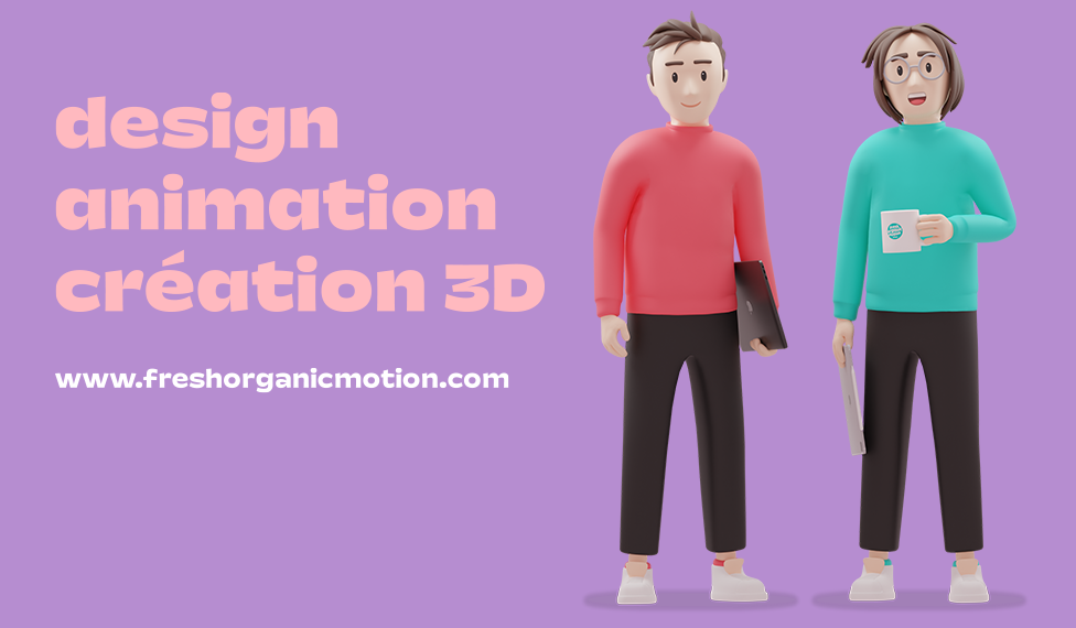
Our Fresh Organic Motion studio is expert in branding and visual creation. We're here to help.